Facilitating Meaningful Comparisons
Contents
11.3. Facilitating Meaningful Comparisons#
The same data can be visualized in many different ways, and deciding which plot to make can be daunting. Generally speaking, our plot should help a reader make meaningful comparisons. In this section, we go over several useful principles that can improve the clarity of our plots.
11.3.1. Emphasize the Important Difference#
Whenever we make a plot that compares groups, we consider whether the plot emphasizes the important difference. As a rule of thumb, it’s easier for readers to see differences when plotting objects are aligned in ways that make these comparisons easier to read. Let’s look at an example.
The US Bureau of Labor Statistics publishes data on income. We took the 2020 median full-time-equivalent weekly earnings for people over age 25 and plotted them. We split people into groups by education level and sex:1
labels = {"educ": "Education",
          "income": "Weekly earnings (USD)",
          "gender": "Sex"}
fig = px.bar(earn, x="educ", y="income",
             facet_col="gender", labels=labels,
             width=450, height=250)
fig.update_layout(margin=dict(t=30))

These bar plots show that earnings increase with more education. But arguably, a more interesting comparison is between men and women of the same education level. We can group the bars differently to focus instead on this comparison:
px.bar(earn, x='educ', y='income', color='gender',
       barmode='group', labels=labels,
       width=450, height=250)

This plot is much better; we can more easily compare the earnings of men and women for each level of education. However, we can make this difference even clearer using vertical alignment. Instead of bars, we use dots for groups of men and women that align vertically at each education level:
fig = px.line(earn, x='educ', y='income', symbol='gender',
              color='gender', labels=labels, width=450, height=250)
fig.update_traces(marker_size=10)

This plot more clearly reveals an important difference: the earnings gap between men and women grows with education. We considered three plots that visualize the same data, but they differ in how readily we can see the message in the plot. We prefer the last one because it aligns the income differences vertically, making them easier to compare.
Notice that in making all three plots, we ordered the education categories from the least to greatest number of years of education. This ordering makes sense because education level is ordinal. When we compare nominal categories, we use other approaches to ordering.
11.3.2. Ordering Groups#
With ordinal features, we keep the categories in their natural order when we make plots, but the same principle does not apply for nominal features. Instead, we choose an ordering that helps us make comparisons. With bar plots, it’s a good practice to order the bars according to their height, while for box plots and strip plots, we typically order the boxes/strips according to medians.
The two bar plots that follow each compare the mean lifespan for types of dog breeds:
lons = dogs.groupby('group')[['longevity']].mean().reset_index()
f1 = px.bar(lons, x='longevity', y='group')
f2 = px.bar(lons.sort_values('longevity', ascending=False),
            x='longevity', y='group')

fig = left_right(f1, f2, width=600, height=200, horizontal_spacing=0.2)
fig.update_xaxes(title_text='Mean longevity (yr)')
fig

The plot on the left orders the bars alphabetically. We prefer the plot on the right because it has orders the bars by longevity, which makes it easier to compare longevity across the categories. We don’t have to bounce back and forth or squint to guess whether herding breeds have a shorter lifespan than toy breeds.
As another example, the following two sets of box plots each compare the distribution of sale price for houses in different cities in the San Francisco East Bay area:
cities = ['Richmond', 'El Cerrito', 'Albany', 'Berkeley',
          'Walnut Creek', 'Lamorinda', 'Piedmont']

sfh_cities = sfh.query('city in @cities')

meds = (sfh_cities.groupby('city')
 ['price']
 .transform('median')
)
by_medians = (sfh_cities.assign(med=meds)
 .sort_values('med', ascending=False)
)

f1 = px.box(sfh_cities, x='price', y='city', log_x=True)
f2 = px.box(by_medians, x='price', y='city', log_x=True)
fig = left_right(f1, f2, horizontal_spacing=0.2)
fig.update_xaxes(title_text='Sale price (USD)')
fig.update_layout(width=600, height=250)
fig

We prefer the plot on the right since it has boxes ordered according to the median price for each city. Again, this ordering makes it easier to compare distributions across groups, in this case cities. We see that the lower quartile and median price in Albany and Walnut Creek are roughly the same, but the prices in Walnut Creek have a greater right skew.
When possible, ordering bars in a bar plot by height and boxes in a box plot by median makes it easier for us to make comparisons across groups. Another technique used for presenting grouped data is stacking. We describe stacking in the next section and provide examples that are meant to convince you to steer away from this sort of plot.
11.3.3. Avoid Stacking#
The figure that follows shows a stacked bar plot in which there is one bar for each city and these bars are divided according to the proportion of houses sold that have from one to eight or more bedrooms. This is called a stacked bar plot. The bar plot is based on a cross-tabulation:
br_crosstab = pd.crosstab(sfh_cities.city, sfh_cities.br,
                          margins=False, normalize='index')
br_crosstab
| br | 1.0 | 2.0 | 3.0 | 4.0 | 5.0 | 6.0 | 7.0 | 8.0 |
|---|---|---|---|---|---|---|---|---|
| city | ||||||||
| Albany | 1.21e-01 | 0.56 | 0.25 | 0.05 | 9.12e-03 | 1.01e-03 | 2.03e-03 | 4.05e-03 |
| Berkeley | 6.91e-02 | 0.38 | 0.31 | 0.16 | 4.44e-02 | 1.42e-02 | 6.48e-03 | 7.23e-03 |
| El Cerrito | 1.81e-02 | 0.34 | 0.47 | 0.14 | 2.20e-02 | 6.48e-03 | 0.00e+00 | 6.48e-04 |
| Piedmont | 8.63e-03 | 0.22 | 0.40 | 0.26 | 9.50e-02 | 1.29e-02 | 7.19e-03 | 1.44e-03 |
| Richmond | 3.60e-02 | 0.36 | 0.42 | 0.15 | 2.52e-02 | 7.21e-03 | 7.72e-04 | 7.72e-04 |
| Walnut Creek | 1.16e-01 | 0.35 | 0.30 | 0.18 | 4.37e-02 | 5.08e-03 | 4.12e-04 | 2.75e-04 |
Each bar in the plot has the same height of 1 because the segments represent the proportion of houses with one or more bedrooms in a city and so add to 1 or 100%:
fig = px.bar(br_crosstab, width=450, height=300)
fig.update_layout(yaxis_title=None, xaxis_title=None,
                 legend_title="# Bedrooms")
fig.show()

It’s easy to compare the proportion of one-bedroom houses in each of the cities by simply scanning across the top of the first segment in each column. But the comparison of four-bedroom houses is more difficult. The bottoms of the segments are not aligned horizontally, so our eyes must judge the lengths of segments that move up and down across the plot. This up-and-down movement is called jiggling the baseline. (We recognize that with so many colors, this plot does not render well in grayscale, but our goal is to steer you away from plots like this one and the next, so we have kept all of the colors for those of you reading the online version.)
Stacked line plots are even more difficult to read because we have to judge the gap between curves as they jiggle up and down. The following plot shows carbon dioxide (CO2) emissions from 1950 to 2012 for the 10 highest emitters:
co2 = pd.read_csv("data/co2_by_country.csv", skiprows=2,
                  encoding = "ISO-8859-1",
                  names=["Country", "Year", "CO2"])
last_year = co2.Year.iloc[-1]
q = (f"Country not in ['World', 'European Union (15)', 'European Union (28)']"
     f"and Year == {last_year}")
top10_lasty = co2.query(q).sort_values('CO2', ascending=False).iloc[:10]
top10 = co2[co2.Country.isin(top10_lasty.Country) & (co2.Year >= 1950)]
co2_labels ={'CO2':'CO<sub>2</sub> emissions (million tons)'}
px.area(top10, x='Year', y='CO2',
              color='Country', line_group='Country', labels = co2_labels,
              width=600, height=350)

Since the lines are stacked on top of each other, it’s very hard to see how the emissions for a particular country have changed and it’s hard to compare countries. Instead, we can plot each country’s line without stacking, as the next plot illustrates:
fig = px.line(top10, x='Year', y='CO2', color='Country',
              log_y=True, width=600, height=350)

# To make some lines dashed, dotted, dash-dot:
from itertools import cycle
styles = cycle([None, 'dashdot', 'dash', 'dot'])
for i in range(10):
    fig.update_traces(selector=i,
                      line=dict(dash=next(styles)))
fig.update_yaxes(title_text='CO<sub>2</sub> emissions (million tons)')
fig

Now it’s much easier to see changes for individual countries and to compare countries because we need judge only y-axis positions rather than short vertical segments with different baselines. We also used a log scale on the y-axis. We can now see that some countries have had flat rates of growth in CO2 emissions, such as the United States and Japan, while others have increased much more quickly, like China and India, and Germany has slowed its CO2 emissions. These aspects were nearly impossible to detect when each country’s baseline jiggled across the plot.
In both of these plots, to make it easier to tell one country from the next, we have used different line types and colors. Choosing colors to facilitate comparisons relies on many considerations. This is the topic of the next section.
11.3.4. Selecting a Color Palette#
Choosing colors also plays an important role in data visualization. We want to avoid overly bright or dark colors so that we don’t strain the reader’s eyes. We should also avoid color palettes that might be difficult for colorblind people—7 to 10% of people (mostly males) are red-green colorblind.
For categorical data, we want to use a color palette that can clearly distinguish between categories. One example is shown at the top in Figure 11.2. From top to bottom, these palettes are qualitative for categorical data; diverging for numeric data where you want to draw attention to both large and small values; and sequential for numeric data where you want to emphasize either large or small values.
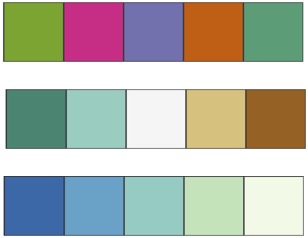
Fig. 11.2 Three printer-friendly palettes from ColorBrewer 2.0#
For numeric data, we want to use a sequential color palette that emphasizes one side of the spectrum more than the other or a diverging color palette that equally emphasizes both ends of the spectrum and deemphasizes the middle. A sequential palette is shown at the bottom and a diverging palette is shown in the middle of Figure 11.2.
We choose a sequential palette when we want to emphasize either low or high values, like cancer rates. We choose a diverging palette when we want to emphasize both extremes, like for two-party election results.
It’s important to choose a perceptually uniform color palette. By this we mean that when a data value is doubled, the color in the visualization looks twice as colorful to the human eye. We also want to avoid colors that create an afterimage when we look from one part of the graph to another; colors of different intensities that make one attribute appear more important than another; and colors that colorblind people have trouble distinguishing between. We strongly recommend using a palette or a palette generator made specifically for data visualizations.
Plots are meant to be examined for long periods of time, so we should choose colors that don’t impede the reader’s ability to carefully study a plot. Even more so, the use of color should not be gratuitous—colors should represent information. On a related note, people typically have trouble distinguishing between more than about seven colors, so we limit the number of colors in a plot. Finally, colors can appear quite different when printed on paper in grayscale than when viewed on a computer screen. When we choose colors, we keep in mind how our plots will be displayed.
Making accurate comparisons in a visualization is such an important goal that researchers have studied how well people perceive differences in colors and other plotting features such as angles and lengths. This is the topic of the next section.
11.3.5. Guidelines for Comparisons in Plots#
Researchers have studied how accurately people can read information displayed in different types of plots. They have found the following ordering, from most to least accurately judged:
Positions along a common scale, like in a rug plot, strip plot, or dot plot
Positions on identical, nonaligned scales, like in a bar plot
Length, like in a stacked bar plot
Angle and slope, like in a pie chart
Area, like in a stacked line plot or bubble chart
Volume and density, like in a three-dimensional bar plot
Color saturation and hue, like when overplotting with semitransparent points
As an example, here is a pie chart that shows the proportion of houses sold in San Francisco that have from one to eight or more bedrooms, and a bar chart with the same proportions:
props = sfh['br'].value_counts(dropna=True, normalize=True)*100
ind = np.arange(1,8)
fig = make_subplots(rows=1, cols=2,
                   specs=[[{"type": "pie"}, {"type": "xy"}]])

fig.add_trace(go.Pie(values=props[ind], labels=ind), row=1, col=1)
fig.add_trace(go.Bar(x=ind, y=props[ind]), row=1, col=2)

fig.update_xaxes(title_text="Number of bedrooms", row=1, col=2)
fig.update_layout(width=600, height=250, showlegend=False)
fig.show()

It’s hard to judge the angles in the pie chart, and the annotations with the actual percentages are needed. We also lose the natural ordering of the number of bedrooms. The bar chart doesn’t suffer from these issues.
However, there are exceptions to any rule. Multiple pie charts with only two or three slices in each pie can provide effective visualizations. For example, a set of pie charts of the proportion of two-bedroom houses sold in each of six cities in the San Francisco East Bay area, ordered according to the proportion, can be an impactful visualization. Yet, sticking with a bar chart will generally always be at least as clear as any pie chart.
Given these guidelines, we recommend sticking to position and length for making comparisons. Readers can more accurately judge comparisons based on position or length, rather than angle, area, volume, or color. But, if we want to add additional information to a plot, we often use color, symbols, and line styles, in addition to position and length. We have shown several examples in this chapter.
We next turn to the topic of data design and how to reflect the aspects of when, where, and how the data were collected in a visualization. This is a subtle but important topic. If we ignore the data scope, we can get very misleading plots.
- 1
US government surveys still collect data based on a binary definition of gender, but progress is being made. For example, starting in 2022, US citizens are allowed to select an “X” as their gender marker on their passport application.