Case Study: How Accurate Are Air Quality Measurements?
12. Case Study: How Accurate Are Air Quality Measurements?#
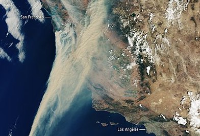
California is prone to wildfires, so much so that its residents (like the authors of this book) sometimes say that California is “always on fire.” In 2020, 40 separate fires covered the state in smoke, forced thousands of people to evacuate, and caused more than $12 billion in damages (Fig. 12.1).

Fig. 12.1 Satellite image from August 2020 showing smoke covering California (image from Wikipedia licensed under CC BY-SA 3.0 IGO)#
In places like California, people use air quality measurements to learn what kinds of protective measures they need to take. Depending on conditions, people may wish to wear a mask, use air filters, or avoid going outside altogether.
In the US, one important source of air quality information is the Air Quality System (AQS), run by the US government. AQS places high-quality sensors at locations across the US and makes their data available to the public. These sensors are carefully calibrated to strict standards—in fact, the AQS sensors are generally seen as the gold standard for accuracy. However, they have a few downsides. The sensors are expensive: typically between $15,000 and $40,000 each. This means that there are fewer sensors, and they are farther apart. Someone living far away from a sensor might not be able to access AQS data for their personal use. Also, AQS sensors do not provide real-time data. Since the data undergo extensive calibration, they are only released hourly and have a time lag of one to two hours. In essence, the AQS sensors are accurate but not timely.
In contrast, PurpleAir sensors, which we introduced in Chapter 3, sell for about $250 and can be easily installed at home. With the lower price point, thousands of people across the US have purchased these sensors for personal use. The sensors can connect to a home WiFi network so that air quality can be easily monitored, and they can report data back to PurpleAir. In 2020, thousands of owners of PurpleAir sensors made their sensors’ measurements publicly available. Compared to the AQS sensors, PurpleAir sensors are timelier. They report measurements every two minutes rather than every hour. Since there are more deployed PurpleAir sensors, more people live close enough to a sensor to make use of the data. However, PurpleAir sensors are less accurate. To make the sensors affordable, PurpleAir uses a simpler method to count particles in the air. This means that PurpleAir measurements can report that air quality is worse than it really is (see Josh Hug’s blog post). In essence, PurpleAir sensors tend to be timely but less accurate.
In this chapter, we plan to use the AQS sensor measurements to improve the PurpleAir measurements. It’s a big task, and we follow the analysis first developed by Karoline Barkjohn, Brett Gantt, and Andrea Clements from the US Environmental Protection Agency. Barkjohn and group’s work was so successful that, as of this writing, the official US government maps, like the AirNow Fire and Smoke map, include both AQS and PurpleAir sensors and apply Barkjohn’s correction to the PurpleAir data.
Our work follows the data science lifecycle, beginning with considering the question and the scope of the available data. Much of our effort is spent cleaning and wrangling the data into shape for analysis, but we also carry out an exploratory data analysis and build a model for generalization. We begin by considering the question and the design and scope of the data.
